Compared to the previous week where I had a very hard, and quite boring time coding, this week was a very welcomed change of pace. I’ve been able to shift my focus from my other classes-since I’ve finished most of the work-to mainly the work I’m doing for this class. I’ve gotten substantial amounts of work done on the script of digital project, and got more time to use the digital tools that we learn about each weak.
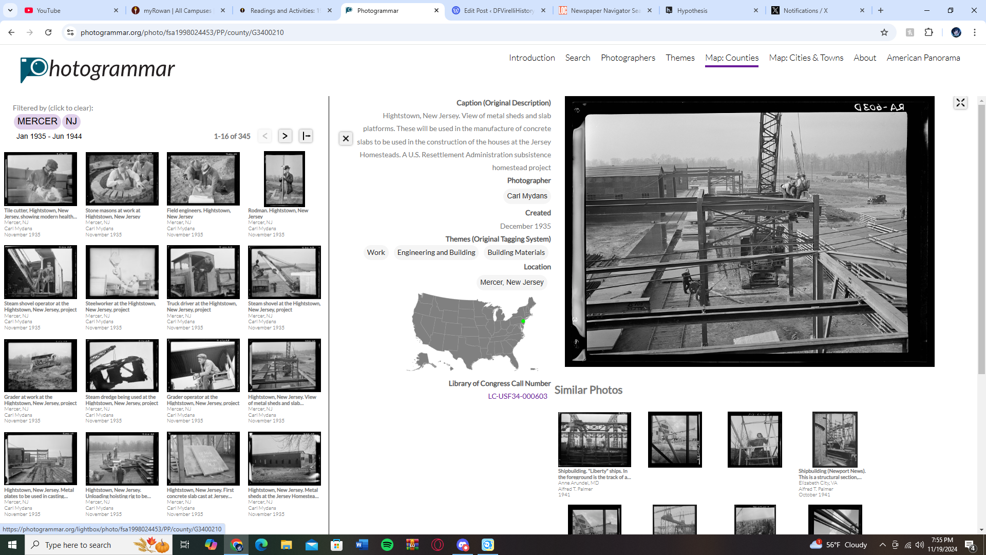
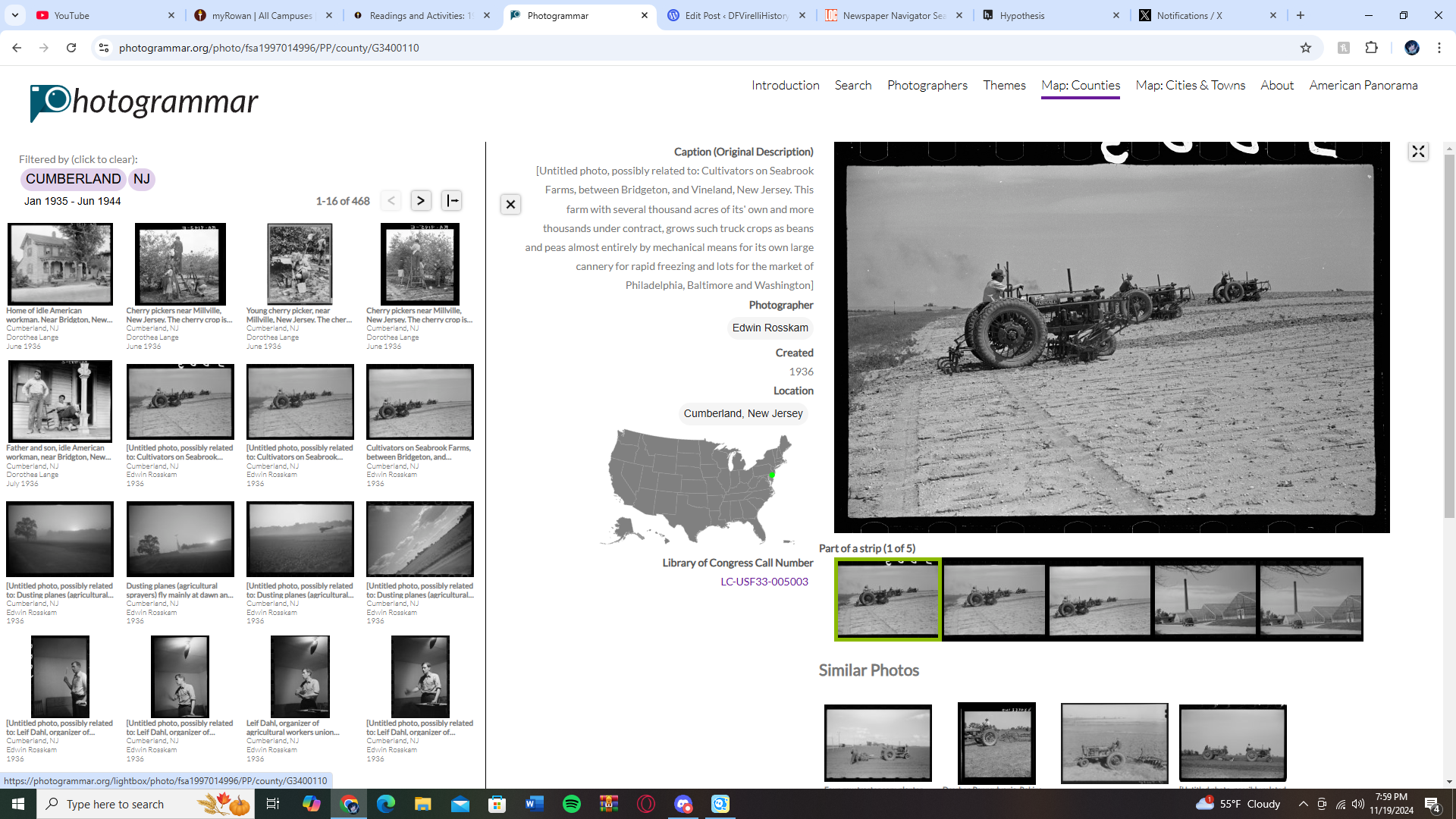
I absolutely adored the photogrammer website. As I’ve stated before on blog posts, I am a huge fan of maps. I love how you can also see the density and how many photos are in each state, and through that you can even see the different types of people in each state. For example, if you click on New Jersey on the map, the pictures you see from Cumberland and Camden County, you see a lot more rural farming pictures. However, if you look at pictures from further north in places like Hudson and Bergen, you see more advanced construction, it tells us that places further north near New York-a high population area-were further along technologically then rural areas.
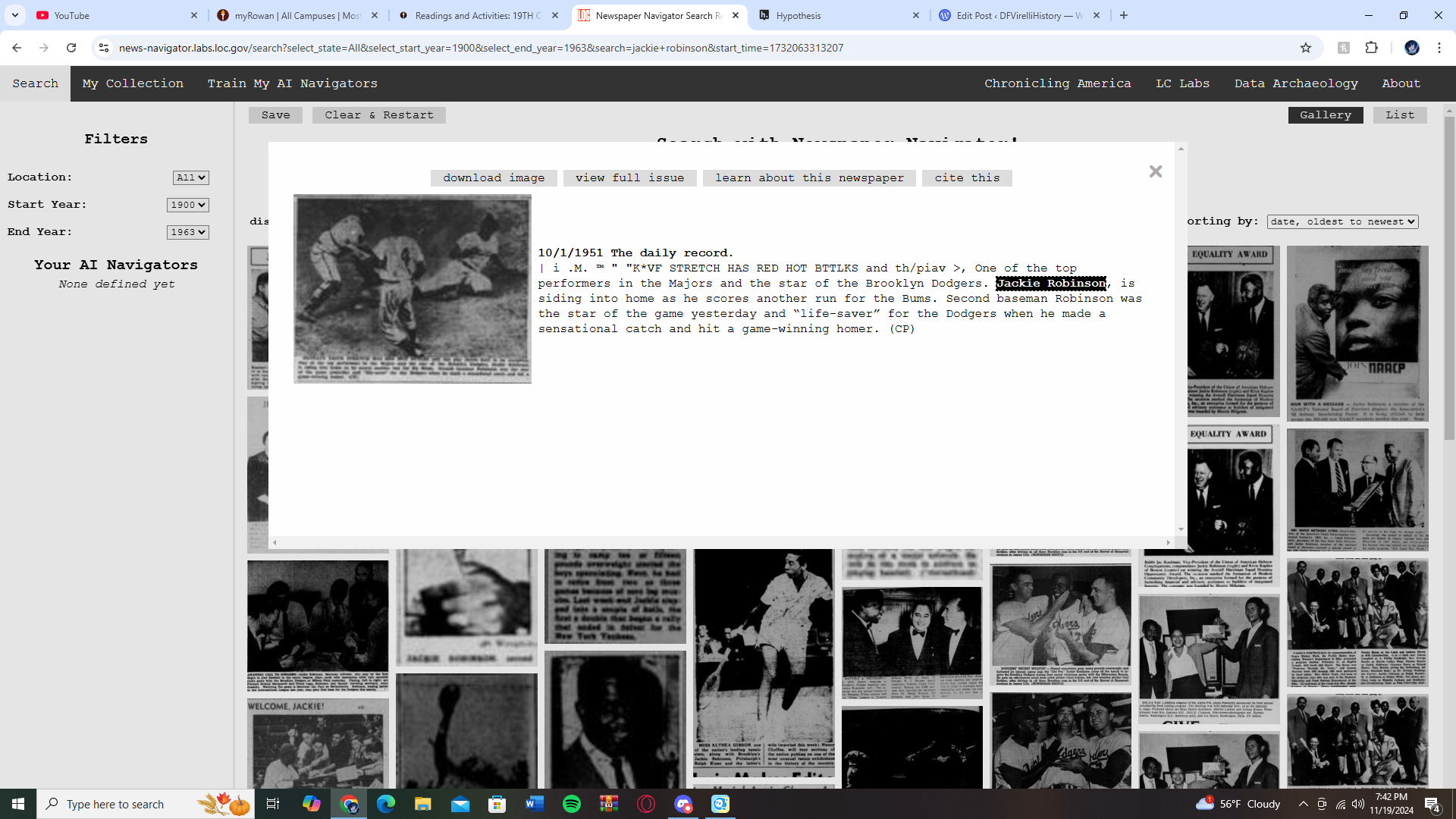
This, was also the case with the Newspaper Navigator where I looked up the name “Jackie Robinson”. You could see every newspaper article in the database, even from his college days all the way up to when he signed with the Dodgers, and then even when he became a league executive after his career. Now, I recognize this is best used for photographs and will only use material from the last hundred years or so, but I also would love to see something like this with more ancient materials.
These programs along with Chronicling America, went of course hand and hand with what we read this week. The title of this post is what I took from the week as a whole, and that of course is that a picture is worth a 1,000 words. Early on, on page 5 the phrase ‘claims to objectivity through computational interpretation no longer hold’. Objectivity is something that we always seem to strive for in not just historical research, but just about every other field of study. The fact of the matter does still remain that even through images like these objectivity remains almost unachievable, due to the simple fact that like we’ve discussed all semester there will always be a human element even in pictures like this. Someone with biases area always writing the metadata, the descriptions, and if the images are of people who aren’t around anymore, they could be taken into a completely different context, and an image can be used to drive a narrative as more objective evidence even further for any argument they may have.
“Special status of the photographic image: It is a message without code.”. That is the quote that out of the 75 pages stood out the most and it was when I finally grasped what was being proven throughout the rest of the reading as well. Images making meaning was also something that stuck out, in the notation itself, I made a comparison to this statement and how we see colors. Gold for example is associated with wealth, red is often seen as the ‘bad guys’ color while blue is the ‘good guys’. Images can be seen the same way. This is similar to the example given of what people may think of seeing a headline with images of dark clouds over a sandy beach with palm trees. That would make people assume that the headline is about a severe weather event, and this concept I see myself extending to my own digital project.
My project evolved from just a podcast episode to a full on YouTube video, with plenty of images to help gain better context for each of the periods of history that I’m going to be discussing. Images are like many things we’ve discussed, a double edged sword, one that can either help objectivity in research or be a hinderance, it all comes back down to of course the human element, like things always will.
Leave a Reply